import pandas as pd
import numpy as np
from calendar import month_abbr
## load data
df = pd.read_csv('data/temperatures.csv')
## isolate year,month,day
df['Date'] = pd.to_datetime(df['Date'])
df['Year'] = df['Date'].dt.year
df['Month'] = df['Date'].dt.strftime('%b') ## month short form
df['Day'] = df['Date'].dt.day
## sort month alphabethically
month_order = list(month_abbr)[1:]
df['Month'] = pd.Categorical(df['Month'], categories=month_order, ordered=True)
## drop leap day
df = df[~((df['Month'] == 'Feb') & (df['Day'] == 29))]
## transform temp
df['Data_Value'] = df['Data_Value'] / 10
## group temps
max_temp_0514 = df[(df['Element'] == 'TMAX') & (df['Year'] < 2015)].groupby(['Month','Day'], observed=True).agg({'Data_Value': 'max'})
min_temp_0514 = df[(df['Element'] == 'TMIN') & (df['Year'] < 2015)].groupby(['Month','Day'], observed=True).agg({'Data_Value': 'min'})
max_temp_2015 = df[(df['Element'] == 'TMAX') & (df['Year'] == 2015)].groupby(['Month','Day'], observed=True).agg({'Data_Value': 'max'})
min_temp_2015 = df[(df['Element'] == 'TMIN') & (df['Year'] == 2015)].groupby(['Month','Day'], observed=True).agg({'Data_Value': 'min'})
## rename
max_temp_0514.rename(columns={'Data_Value': 'Max_Temp_0514'}, inplace=True)
min_temp_0514.rename(columns={'Data_Value': 'Min_Temp_0514'}, inplace=True)
max_temp_2015.rename(columns={'Data_Value': 'Max_Temp_2015'}, inplace=True)
min_temp_2015.rename(columns={'Data_Value': 'Min_Temp_2015'}, inplace=True)
## join df and find broken records
df_temp = pd.merge(max_temp_0514, min_temp_0514, on=['Month', 'Day'])\
.merge(max_temp_2015, on=['Month', 'Day'])\
.merge(min_temp_2015, on=['Month', 'Day'])
df_temp['Broke_Record_Max'] = df_temp['Max_Temp_2015'] > df_temp['Max_Temp_0514']
df_temp['Broke_Record_Min'] = df_temp['Min_Temp_2015'] < df_temp['Min_Temp_0514']
## drop 29/30/31 in Feb because of merge
df_temp.dropna(inplace=True)
# plotting
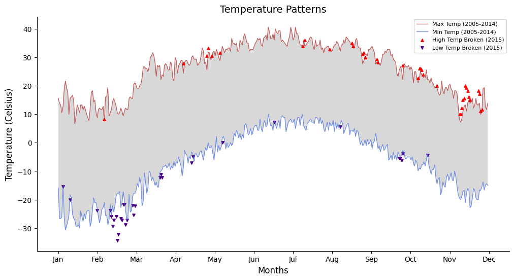
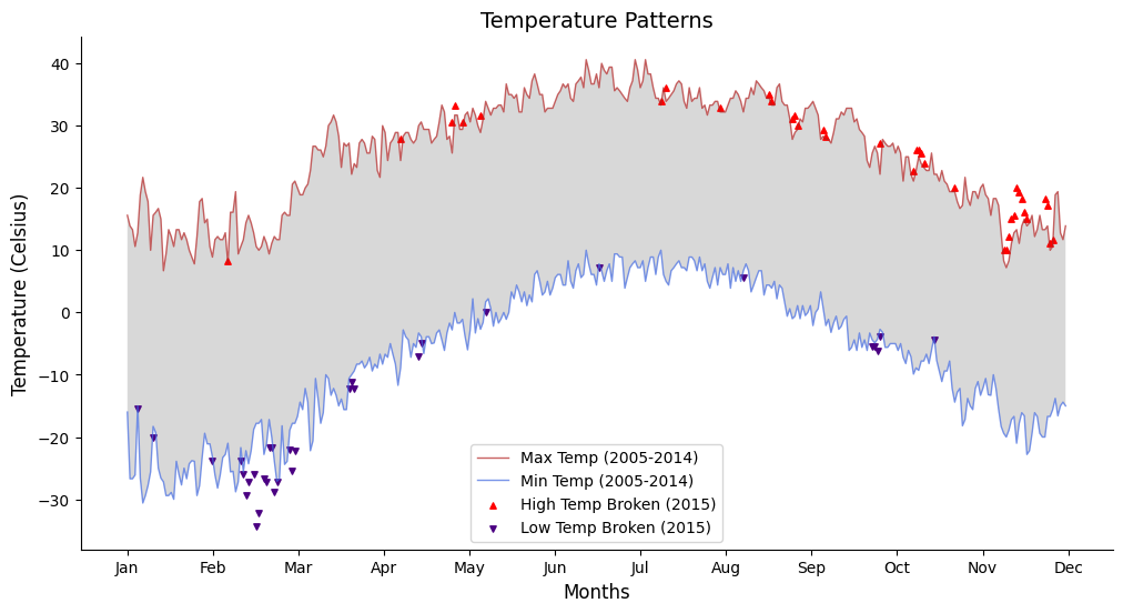
fig, ax = plt.subplots(figsize=(12, 6))
plt.plot(df_temp['Max_Temp_0514'].values, label='Max Temp (2005-2014)', linewidth=1, alpha = 0.7, c='firebrick')
plt.plot(df_temp['Min_Temp_0514'].values, label='Min Temp (2005-2014)', linewidth=1, alpha = 0.7, c='royalblue')
plt.fill_between(range(df_temp.shape[0]), df_temp['Max_Temp_0514'], df_temp['Min_Temp_0514'], facecolor='gray', alpha=0.3)
plt.scatter(np.where(df_temp['Broke_Record_Max'] == True),
df_temp[df_temp['Broke_Record_Max'] == True]['Max_Temp_2015'].values,
s=15, color='red', label='High Temp Broken (2015)', marker='^')
plt.scatter(np.where(df_temp['Broke_Record_Min'] == True),
df_temp[df_temp['Broke_Record_Min'] == True]['Min_Temp_2015'].values,
s=15, color='indigo', label='Low Temp Broken (2015)', marker='v')
plt.legend(loc = 'best', fontsize=10)
plt.xticks(np.linspace(0, 365, num = 12), list(month_abbr)[1:], size=10)
plt.yticks(size=10)
plt.xlabel('Months', size = 12)
plt.ylabel('Temperature (Celsius)', size = 12)
plt.title('Temperature Patterns', size = 14)
ax.spines[['right', 'top']].set_visible(False)
# ax.spines[['bottom', 'left']].set_alpha(0.3)
# ax.tick_params(axis='x', color='gray')
# ax.tick_params(axis='y', color='gray')
plt.show()